Alana - who calls herself Dee - combines photography with drawing, creating beautiful images. The majority of Dee's work concentrates on human flesh, and she adds her personal touches through drawing, almost like tattoos, to the print. The effect is really quite impressive.
Tuesday, 16 July 2013
Wednesday, 19 June 2013
Summer Exhibition - Royal Academy REVIEW
The Summer Exhibition at the Royal Academy is now in its 245th year, a very traditional exhibition, widely regarded as outdated and old fashioned by critics however in recent years, the people at the Royal Academy of Arts have tried to mix traditional artworks with slightly more modern pieces. This year, the artwork still mostly revolved around painting and so called 'wall art' rather than installation, and there was also a distinctive lack of film. The exhibition showcases over 1000 artworks from artists who have submitted from all over the world, from the likes of the well known Albert Irvin and Grayson Perry, to the not so well known new artists.
I went to the exhibition with a friend from my course, we firstly went to the wrong Royal Academy building but were kindly directed by security to the right space. The exhibition is held amongst the richer sites of London, behind the wealthy shops of Regent Street and the Piccadilly Arcade, certainly putting the visitor in the right frame of mind and outlining certain behaviours for the exhibition.
In the courtyard, builders were still working on erecting a grand sculpture in the front, slightly disappointing considering the exhibition had already been open a couple of days. However, a large wall sculpture, 15x23 metres, by El Anatsui adorns the front of the exhibition and makes a very impressive sight before entering the Royal Academy.
Entering the Royal Academy brings the visitor straight into the ticket hall, be prepared to pay up to £10 for your ticket with concessions for students, OAPs and children, not too pricey for an exhibition in central London. The exhibition itself was quite impressive, though I do think some of the artworks were a little too expensive for what they were... but I suppose that's the art world for you! I have sneakily taken photos of the highlights of the show, much to the contempt of the gallery staff (sorry).
 |
| Untitled by Mimmo Paladino Hon - one of the most expensive pieces at the RA exhibition reaching over £100,000 |
My favourite piece from the exhibition is by Barbara Macfarlane, titled Copper Spires III (below). The artwork from a distance is resonant to a map of London and the Thames river, but the closer you get to the piece the more abstract it gets. Using the colours of the British flag, Barbara creates an impressive and busy, patriotic and exciting artwork.
The sculpture below, titled Nike by James Butler, reminded me of the Victory of Samothrace sculpture in The Louvre Paris, before I'd even read the title. Both sculptures are of the same subject, the Goddess Nike, and Butler has clearly been inspired by the world famous sculpture with his attempts in creating a newer version. The Victory of Samothrace was made in 2nd century BC, using the traditional material of marble. Butler's Nike is also made from a traditional material, bronze, but Butler has coated the sculpture in silver. The metallic shine of the silver gives a more futuristic and contemporary look on the old style. Butler's figure is also more streamline, the only recognisable features of the sculpture being the wings and the outline of the goddess' figure. Butler's piece is resonant to Umberto Boccioni's Unique Forms of Continuity in Space, another modern take on the Victory of Samothrace through the Futurist movement in 1912. The Futurist's said that a speeding car was more beautiful than the Victory of Samothrace, therefore Boccioni has combined the features of both a motor and a sculpture to create a fusion of flesh and metal, an impressive hybrid of man and machine. Unique Forms... was cast in bronze, like Butler's sculpture, and Nike feels like a step onwards from Boccioni's piece.
 |
| Nike - if you'd like one it's yours for £17,000 |
 |
| Victory of Samothrace |
 |
| Unique Forms of Continuity in Space |
I was happy to see multiple work by Albert Irvin being displayed at the exhibition, a clear example of British abstract expressionism and home grown talent. Irvin is a member of the Royal Academy and has been since 1998, now in his early 90s, he still creates artworks today in his London studio.
Another artist I am always impressed with is Chuck Close. Close is an American photorealist painter with a difference, he paints the majority of his images using thousands of dots of colour, which from afar create a hyper realistic portrait. Below is the piece exhibited at the Summer Exhibition.
 |
| Another piece by Chuck Close in his classic style |
 |
| A closer example of his style - truly incredible! |
 |
| £14,750 |
The last painting which stood out to me before we left is by Issa Salliander, titled Maobino 0.1 (below). This is because it reminded me of a similar artwork by Jenny Saville, Stare, and Saville is one of my favourite artists. Both paintings show a similar subject, a young boy staring with glassy eyes, and neither are painted in a conventional sense. I would not be suprised if Salliander cited Saville as an influence for the piece.
 |
| Maobino 0.1 (£3,400) |
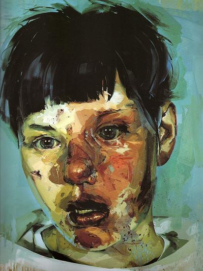 |
| Stare |
Grayson Perry's tapestries were the cover image for the catalogue for the Summer Exhibition, and Perry had a whole room dedicated to his tapestries at the Royal Academy. This is quite an achievement considering the Royal Academy is intended to showcase a years worth of artistic talents and most artists are lucky enough to have one artwork submitted each year. Perry's tapestries are bursting with colour and activity, each figure within the artwork as if they are charactures of who they are meant to represent. Yet the tapestries have fairly dark and sorrowful morals behind them, for example the image below illustrates a woman remembering holding a man in her arms while he died from a car crash. Perry's tapestries are impressive and each one in the room complimented the other nicely. He was ultimately the star of this years exhibition.
 |
| Grayson Perry room |
Most walls were painted white, but interestingly the room in the middle which had an added emphasis on architecture and construction was canary yellow. I can imagine that this is because the drawings and plans displayed were predominately white and therefore to make them standout the wall was painted a contrasting colour.
The Royal Academy Summer Exhibition in all was a good show, and it was good for me to see new and upcoming talent, as well as admiring artworks by already well established artists. On the other hand, the show felt too small, despite there being over 1000 artworks, because they were piled so high on top of eachother I felt as if I didn't get the full effect of too many, considering Grayson Perry had a whole room dedicated to 6 or 7 tapestries, and some artists had their work squeezed at the top near the ceiling. I intend to visit the 'Not the Royal Academy' art show at the Llewellyn Alexander Gallery in London in the next coming weeks. This exhibition is showing many artworks which did not make it into the Royal Academy's, with many critics giving it the thumbs up and saying it is better than the RA show, it is certainly not to be missed, and interesting to compare.
The Summer Exhibition is on till the 18th August
Not the Royal Academy is on till the 17th August
Wednesday, 12 June 2013
Meghan Howland
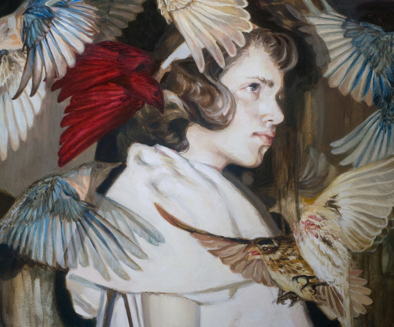
Meghan is a young artist, born in 1985, living and working in Portland, Maine. She studied painting at the New Hampshire Institute of Art, and studied in Italy for a year also. Meghan's close detail of figures clothes and hair is outstanding, but most interestingly she focuses many of her paintings around the obstruction of the face, most commonly birds with outstretched wings.
Meghan kindly sent me her statement:
Meghan kindly sent me her statement:
"Meghan Howland is an emerging artist living and working in Portland, Maine. Her work offers a unique range of styles and observations, while often personal in their meaning, ventures to examine larger cultural and emotional issues. Through a haze of oil paint, and sometimes animals, we are confronted by situations that are at once disarmingly beautiful, yet are infused with an implied sense of yearning, loss, or disaster. In recent work, subjects are bathed in nature in a subtly unnatural way. Naive to or unaffected by what is happening around them, figures are often used to explore issues of fragility, identity, and our individual understandings of nature within our own personal, somewhat obscure relationship to it."
Labels:
art,
art and about,
art blog,
art history,
art project,
art review,
artist,
avant garde,
birds,
blog,
color,
colour,
creative,
paint,
painting,
realism,
usa
Monday, 10 June 2013
Huang Zheng
Huang Zheng, a Chinese artist, paints hyper realistic portraits up close of women's faces.
Labels:
art,
art and about,
art blog,
art history,
art project,
art review,
artist,
blog,
classic art,
drawing,
hyperrealism,
painting,
realism,
realist,
sketch,
student
Monday, 27 May 2013
2000 views!
Thanks to everyone who has taken the time out to read the blog. Didn't make this to gain followers but it's nice to know people are reading what I'm putting down.
Picasso's Blue Period
In the spring of 1901, Picasso learnt about the suicide of friend and fellow painter Carlos Casagemas, and fell into deep depression. These blue paintings are a representation of Picasso's melancholy and sombre mood throughout the years 1901-4, his mood dominating his paintings. Picasso's Blue Period was followed in 1904 by his Rose Period, when his mood improved and this reflected in the pink, red tones of his paintings.
 |
| La Vie (1903) |
 |
| Casagemas in his Coffin (1901) |
 |
| Portrait of Jamie Sabartes (1901) |
 |
| The Old Guitarist (1903) |
 |
| The Rose Period (The Actor - 1901) |
Labels:
art,
art and about,
art blog,
art history,
art project,
art review,
artist,
blog,
blue period,
classic art,
color,
colour,
drawing,
France,
paint,
painting,
picasso,
picture,
student,
study
Friday, 24 May 2013
The Styles of Henri Matisse
Henri Matisse was one of my favourite artists when I was in 6th form and had left the safety net of realistic art. One of the leading figures of modern art despite starting off fairly safe and realistic, Matisse experimented with Fauvism, Divisionism, Collage and Interior Design.
Fauvism:
From the French 'Fauve' - meaning 'wild beast', the movement lasted from 1904 till 1908, Matisse being one of the leading figures. Inspired by Impressionism, Fauvism uses the same style of bright and expressive colours, yet differs because the colours of the painting have no regards to the natural colours, whereas Impressionist art still suggests the original colour. Matisse and other artists who made art within the movement are regarded as 'Fauves' because Louis Vauxcelles, a critic of the time, commented on an exhibition of Fauve work as 'Donatello parmi les fauves!' (Donatello among the wild beasts!), referring to the Renaissance type sculpture in the room of the exhibition. The movement faced harsh criticism, but today it is what Matisse is most known for!
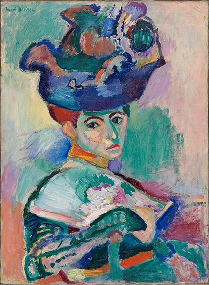 |
| Woman with a Hat (1905) |
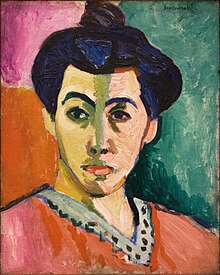 |
| Portrait of Madame Matisse (1906) |
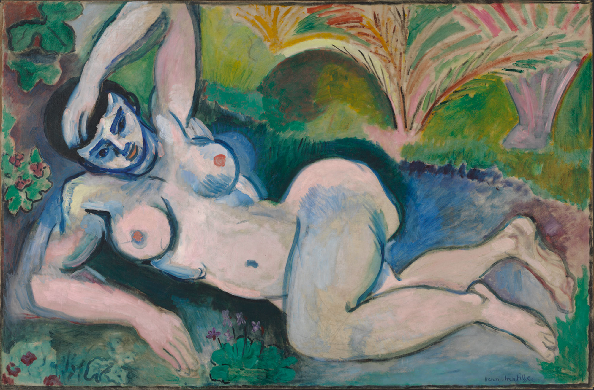 |
| Blue Nude (1907) |
Divisionism:
Also a Neo-Impressionist movement, the style of Divisionism involves not painting by mixing colours, but instead implying tones by separating colour and applying paint with dots and stripes. The movement began with Georges Seurat, A Sunday Afternoon on the Island of La Grande Jatte (1884-6), and the style was used in the late 19th and early 20th century by prominent artists such as Robert Delaunay, Vincent van Gogh and Matisse.
 |
| A Sunday Afternoon on the Island of La Grande Jatte (1884-6) - Georges Seurat |
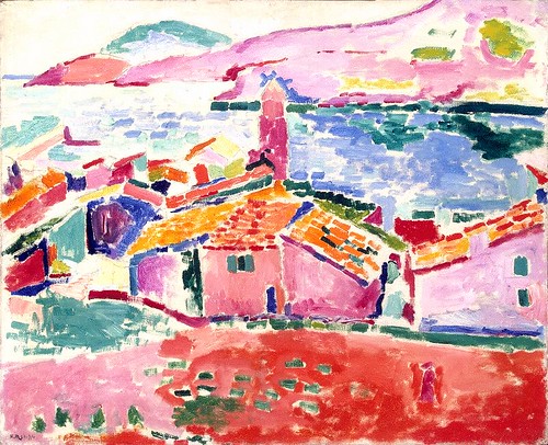 |
| Les toits de Collioure (1905) - Matisse |
 |
| Self Portrait with a Felt Hat (1888) - Van Gogh |
Collage:
In the 1940s Matisse was diagnosed with cancer and had to start using a wheelchair. Despite being incredibly ill, Matisse found a new lease of life through paper cut outs. His paper cut outs, often on an enormous scale, were made using the scissors freehand to make shapes. After cutting the shapes, Matisse would pin the paper to the walls of his studio and arrange the forms into an arrangement Matisse found most appropriate. In 1947, Matisse published a book Jazz full of his paper cut outs.
 |
| Blue Nude (1952) |
 |
| The Fall of Icarus (1943) |
 |
| The Snail (1953) |
 |
| La Gerbe (1953) |
Interior Design:
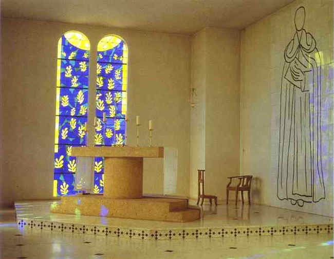
In 1947, Matisse was asked by Sister Jacques-Marie to design the interior of the Chapelle du Rosaire de Vence, a church in the French riviera. The end project is very obviously Matisse, the figures and the stain glass very similar to his paper cut outs. Possibly one of the biggest jobs of Matisse's life, the design took 4 years to complete, and Matisse died a few years after its completion.
 |
| Matisse and Sister Jacques-Marie |
Labels:
art,
art and about,
art blog,
art history,
art project,
art review,
artist,
avant garde,
church,
color,
colour,
divisionism,
fauvism,
henri matisse,
history,
impressionism,
matisse,
neo-impressionism,
religion
Subscribe to:
Posts (Atom)


_web.jpeg)


