The Summer Exhibition at the Royal Academy is now in its 245th year, a very traditional exhibition, widely regarded as outdated and old fashioned by critics however in recent years, the people at the Royal Academy of Arts have tried to mix traditional artworks with slightly more modern pieces. This year, the artwork still mostly revolved around painting and so called 'wall art' rather than installation, and there was also a distinctive lack of film. The exhibition showcases over 1000 artworks from artists who have submitted from all over the world, from the likes of the well known Albert Irvin and Grayson Perry, to the not so well known new artists.
I went to the exhibition with a friend from my course, we firstly went to the wrong Royal Academy building but were kindly directed by security to the right space. The exhibition is held amongst the richer sites of London, behind the wealthy shops of Regent Street and the Piccadilly Arcade, certainly putting the visitor in the right frame of mind and outlining certain behaviours for the exhibition.
In the courtyard, builders were still working on erecting a grand sculpture in the front, slightly disappointing considering the exhibition had already been open a couple of days. However, a large wall sculpture, 15x23 metres, by El Anatsui adorns the front of the exhibition and makes a very impressive sight before entering the Royal Academy.
Entering the Royal Academy brings the visitor straight into the ticket hall, be prepared to pay up to £10 for your ticket with concessions for students, OAPs and children, not too pricey for an exhibition in central London. The exhibition itself was quite impressive, though I do think some of the artworks were a little too expensive for what they were... but I suppose that's the art world for you! I have sneakily taken photos of the highlights of the show, much to the contempt of the gallery staff (sorry).
 |
| Untitled by Mimmo Paladino Hon - one of the most expensive pieces at the RA exhibition reaching over £100,000 |
My favourite piece from the exhibition is by Barbara Macfarlane, titled Copper Spires III (below). The artwork from a distance is resonant to a map of London and the Thames river, but the closer you get to the piece the more abstract it gets. Using the colours of the British flag, Barbara creates an impressive and busy, patriotic and exciting artwork.


The sculpture below, titled Nike by James Butler, reminded me of the Victory of Samothrace sculpture in The Louvre Paris, before I'd even read the title. Both sculptures are of the same subject, the Goddess Nike, and Butler has clearly been inspired by the world famous sculpture with his attempts in creating a newer version. The Victory of Samothrace was made in 2nd century BC, using the traditional material of marble. Butler's Nike is also made from a traditional material, bronze, but Butler has coated the sculpture in silver. The metallic shine of the silver gives a more futuristic and contemporary look on the old style. Butler's figure is also more streamline, the only recognisable features of the sculpture being the wings and the outline of the goddess' figure. Butler's piece is resonant to Umberto Boccioni's Unique Forms of Continuity in Space, another modern take on the Victory of Samothrace through the Futurist movement in 1912. The Futurist's said that a speeding car was more beautiful than the Victory of Samothrace, therefore Boccioni has combined the features of both a motor and a sculpture to create a fusion of flesh and metal, an impressive hybrid of man and machine. Unique Forms... was cast in bronze, like Butler's sculpture, and Nike feels like a step onwards from Boccioni's piece.
 |
| Nike - if you'd like one it's yours for £17,000 |
 |
| Victory of Samothrace |
 |
| Unique Forms of Continuity in Space |
I was happy to see multiple work by Albert Irvin being displayed at the exhibition, a clear example of British abstract expressionism and home grown talent. Irvin is a member of the Royal Academy and has been since 1998, now in his early 90s, he still creates artworks today in his London studio.
Another artist I am always impressed with is Chuck Close. Close is an American photorealist painter with a difference, he paints the majority of his images using thousands of dots of colour, which from afar create a hyper realistic portrait. Below is the piece exhibited at the Summer Exhibition.
 |
| Another piece by Chuck Close in his classic style |
 |
| A closer example of his style - truly incredible! |
Below are a couple more artworks I picked out from the thousands displayed that I felt really stood out. Below is an oil painting by Peter Wylie called Goldfinger Seven. It shows a block of council flats in England which have become part of the landscape in most cities and towns. Photo realistic, I felt it was a shame that it was displayed so high up and in the corner as it didn't seem to be getting the attention it deserved. This is similar for most of the artworks displayed at a height, but I suppose also the only way to display over 1000 artworks is to pile them over eachother.
 |
| £14,750 |
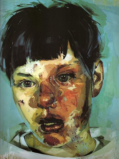
The last painting which stood out to me before we left is by Issa Salliander, titled Maobino 0.1 (below). This is because it reminded me of a similar artwork by Jenny Saville, Stare, and Saville is one of my favourite artists. Both paintings show a similar subject, a young boy staring with glassy eyes, and neither are painted in a conventional sense. I would not be suprised if Salliander cited Saville as an influence for the piece.
 |
| Maobino 0.1 (£3,400) |
 |
| Stare |
Grayson Perry's tapestries were the cover image for the catalogue for the Summer Exhibition, and Perry had a whole room dedicated to his tapestries at the Royal Academy. This is quite an achievement considering the Royal Academy is intended to showcase a years worth of artistic talents and most artists are lucky enough to have one artwork submitted each year. Perry's tapestries are bursting with colour and activity, each figure within the artwork as if they are charactures of who they are meant to represent. Yet the tapestries have fairly dark and sorrowful morals behind them, for example the image below illustrates a woman remembering holding a man in her arms while he died from a car crash. Perry's tapestries are impressive and each one in the room complimented the other nicely. He was ultimately the star of this years exhibition.
 |
| Grayson Perry room |
On the layout of the artworks, the curators were clever in that they used the elaborately decorated door frames of the Royal Academy to frame the artworks, as demonstrated below. It feels as if great care was taken to ensure the artworks were placed in exactly the right spot to maximise the effect. Some walls in the exhibition, there was no piling artworks on top of one another, but most walls were piled high with artworks. This does feel very powerful when first walking into the rooms, however it is a shame that the ones at the top were hard to see. However this is the style of the Royal Academy and has been for almost 250 years, it is part of the tradition of the show.
Most walls were painted white, but interestingly the room in the middle which had an added emphasis on architecture and construction was canary yellow. I can imagine that this is because the drawings and plans displayed were predominately white and therefore to make them standout the wall was painted a contrasting colour.


The Royal Academy Summer Exhibition in all was a good show, and it was good for me to see new and upcoming talent, as well as admiring artworks by already well established artists. On the other hand, the show felt too small, despite there being over 1000 artworks, because they were piled so high on top of eachother I felt as if I didn't get the full effect of too many, considering Grayson Perry had a whole room dedicated to 6 or 7 tapestries, and some artists had their work squeezed at the top near the ceiling. I intend to visit the 'Not the Royal Academy' art show at the Llewellyn Alexander Gallery in London in the next coming weeks. This exhibition is showing many artworks which did not make it into the Royal Academy's, with many critics giving it the thumbs up and saying it is better than the RA show, it is certainly not to be missed, and interesting to compare.
The Summer Exhibition is on till the 18th August
Not the Royal Academy is on till the 17th August


_web.jpeg)